Eurotunnel Dashboard
The problem
Eurotunnel was looking to create a KPI dashboard for their French and UK teams, currently using Easyvista support ticketing service, they got the chance to try making the dashboard with Easyvista Apps, a specific tool creating in order to make the dashboard.
They where looking at the best way to display the data and get a good overview of the status of the support team.
Sketches
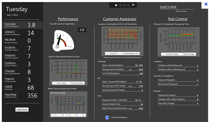
First time making a KPI dashboard, the first step was to look at other company dashboard, to understand why they are displaying some data and how they do it. Then I've make some sketches, here the first one.
Showing this to some users, this design wasn't approve by those users and they wasn't sure about all the information displayed.
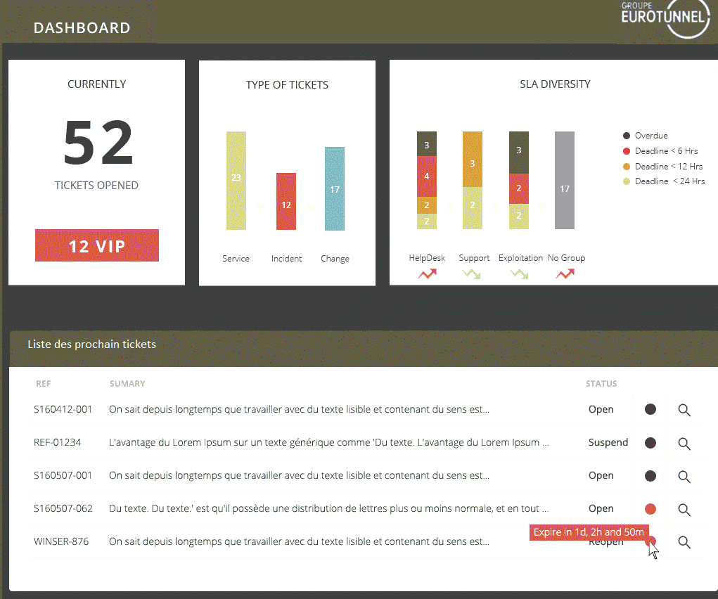
So i've work on an another sketche based on user feedback, cleaning all the useless data, in order to show the only data that was important for them.
The solution
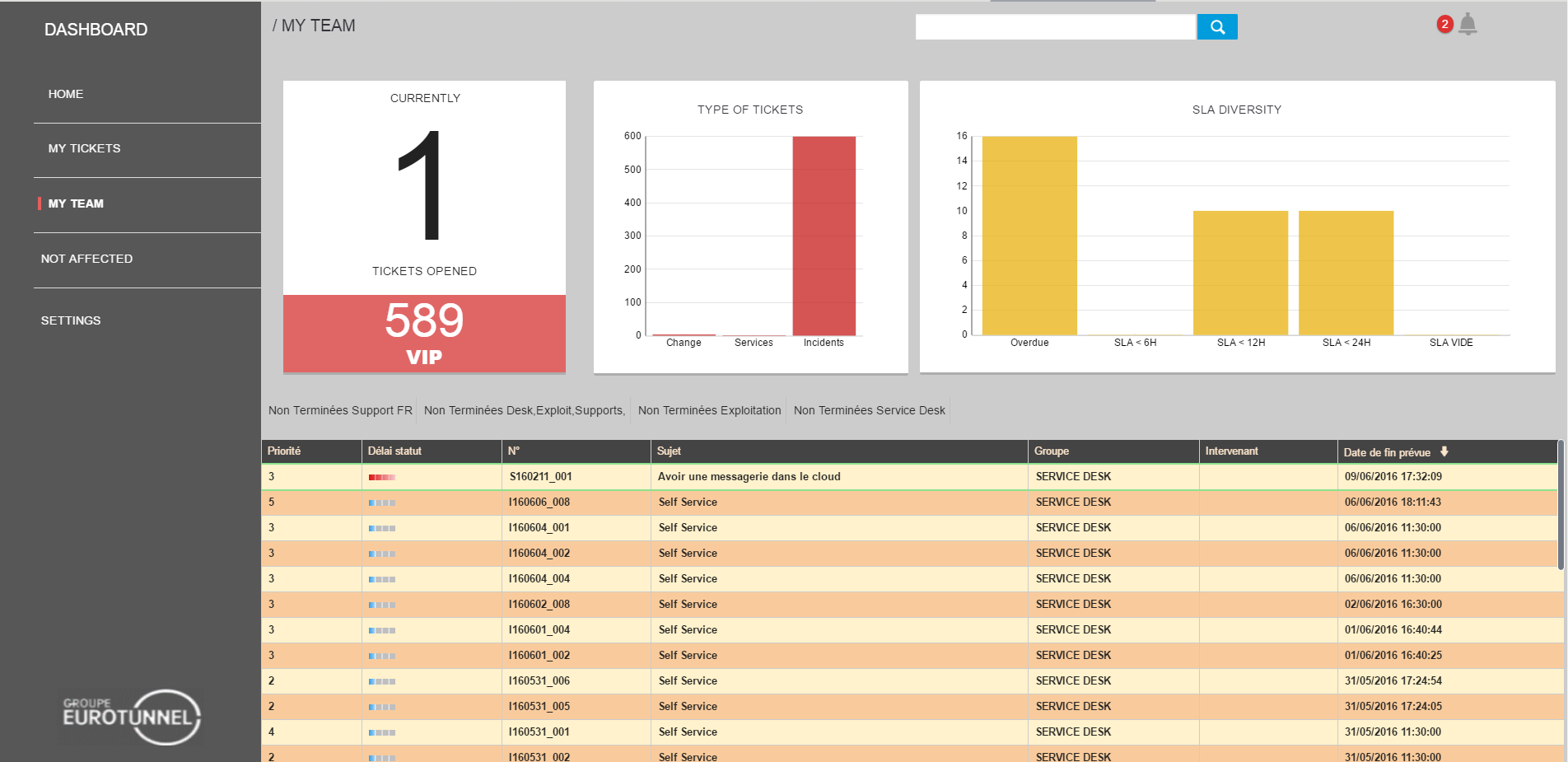
Based on the sketche, i've been working on the data structure the support plateform, looking at the data, we've separed all the information by sectors. Then i've been working on the real UI.
I've done some refactoring from the sketche, simplify those chart a little bit, those screen should been display on large touch sensitive screen, to permit everyone in the room to seek a specific support ticket.
One of the most important business need was to be able showing the detail of a specific ticket, like this :
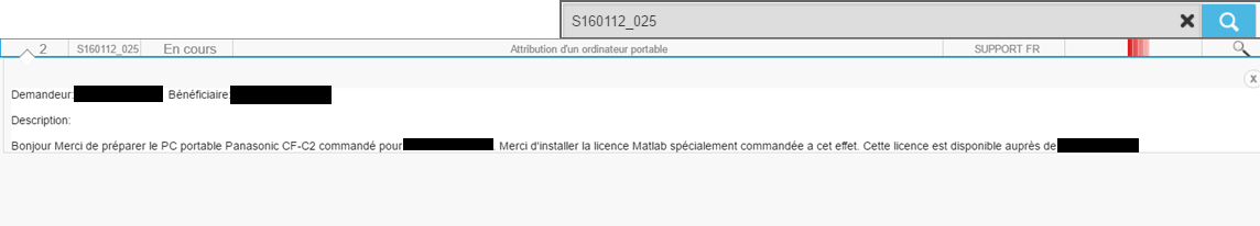
You can see the description, the owner of the demand and the person in charge of it.
From here, i've work on all the other component of the screen from the data to the integration. You can see the result of all my work in the screen below.